Weather Maps
Look at the following weather map. What information does it tell you? Record your thoughts on your notecatcher.
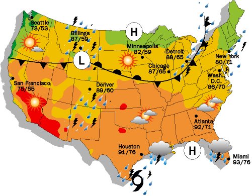
source: http://www.skywatchweather.com/Services/newspapers.html
Weather maps help predict weather patterns by showing important weather information: |
|
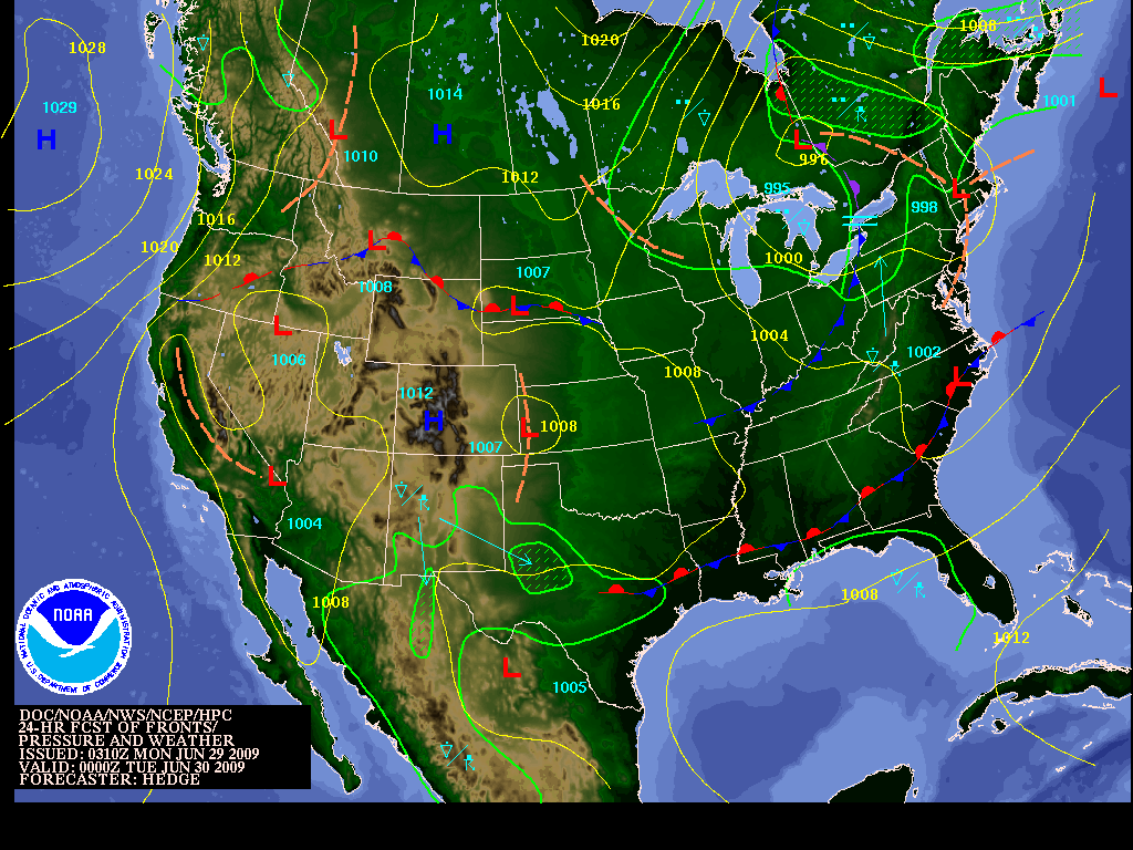
1. High and Low Pressure Systems:
Isobars are lines on weather maps which represent patterns of pressure. They show how pressure is changing over space and so help describe the large-scale weather patterns across a region in the map.
Why do I care? Isobars make it easier to read and analyze weather maps. By looking at patterns of pressure, you can determine weather conditions in the next few days ahead.
What is an isobar?
Isobars are lines of constant or equal pressure on a weather map. They can be used to find areas of low or high pressure over a broad area (like the U.S.), and they can tell us how intense the system may be. On weather maps, you may have noticed areas that have a large “L” or “H” over a region with lines circling around them. The “L” stands for low pressure (where we would expect to find the lowest pressure) and “H” stands for high pressure (where we would expect to find the highest pressure). The lines circling them are isobars. Generally the lowest pressure is where precipitation is most likely to fall, and high pressures are usually associated with clear and sunny conditions. Where the isobars are close together, windy conditions may be expected.
Source: http://www.nc-climate.ncsu.edu/edu/k12/.IsobarIsotherm
Source: http://galleryhip.com/isobar-weather-map.html
2. Movement of Air Masses and Fronts
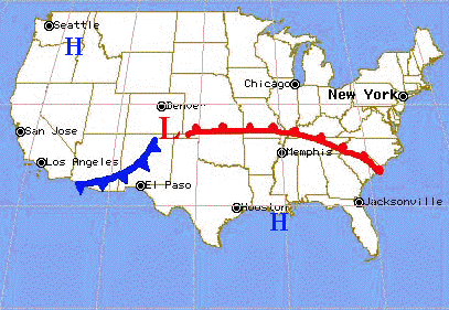
The image above shows an example of a weather map containing a warm and cold front.
A cold front means a cold air mass is pushing into a warmer air mass, and is shown with blue sharp "teeth" pointing the direction of the moving cold air.
A warm front means a warm air mass is pushing into a colder air mass, and is shown with red rounded "teeth" pointing the direction of the moving warm air.
Source (Image and Information): http://www.mv.k12.wa.us/science/integrated/athena/curric/weather/hsweathr/fronts.html
3. Temperature Ranges
Isotherms
Isotherms are lines on weather maps which represent patterns of temperature, respectively. They show how temperature is changing over space and so help describe the large-scale weather patterns across a region in the map.
Why do I care? Isotherms make it easier to read and analyze weather maps. By looking at patterns of temperature, you can determine weather conditions in the next few days ahead.
What is an isotherm?
Isotherms are lines of constant or equal temperature. They are often used on weather maps by meteorologists to give a large scale view of temperatures across the U.S. If you have ever looked at a weather map in a newspaper, the isotherms are used to divide the color-filled temperatures. For example, in the map below, temperatures in the 60's may be represented by a yellow color, while temperatures in the 70's may be represented by an orange color. The line that divides the yellow from the orange is the isotherm. All of the locations between the 60 degree isotherm and the 70 degree isotherm will have a temperature between 60 and 70 degrees.
Source: http://www.nc-climate.ncsu.edu/edu/k12/.IsobarIsotherm
Isotherms represented by colored lines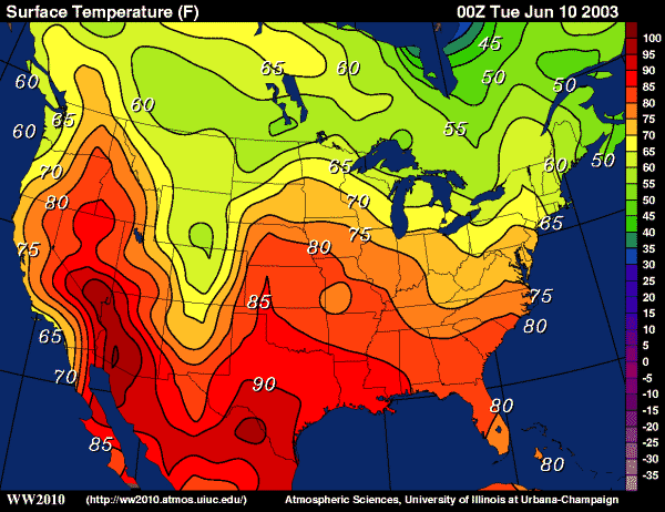
Source: http://middle3.fatcow.com/isotherms.htm
|
Isotherms represented by lines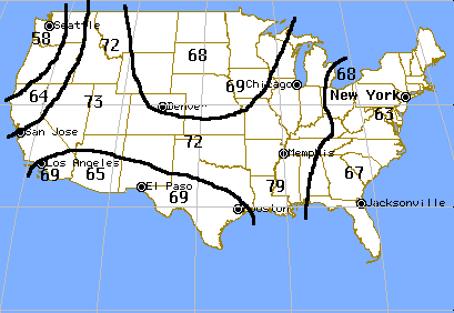
Source: http://www.mv.k12.wa.us/science/integrated/athena/curric/weather/hsweathr/isotherm.html
|

|
|

Woot! Woot! |